


How Colour and Finish Can Transform Commercial Bathroom Cubicles

A commercial washroom is more than a practical space. It can also shape how visitors, customers and staff view a building. The rightcolours, textures and finishes can make a washroom feel clean, modern and welcoming. They can also support the overall style of an office, hotel, school, leisure centre or public facility.
Today, businesses have far more choice than plain white or grey panels. Modern laminate systems can offer bold colours, soft neutrals, woodgrain effects and textured finishes. This makes commercial bathroom cubicles an important part of the interior design rather than an afterthought. Current UK suppliers offer broad ranges of colours and finishes, including solid colours, wood effects and textured options.
Colour Sets the Mood of a Commercial Washroom
Colour has a strong effect on how people experience a room. Light shades can help a smaller washroom feel more open and spacious. White, off-white and light grey can create a clean and simple appearance. These colours also work well with many flooring, wall and sanitaryware choices.
Darker colours can create a more dramatic and premium look. Charcoal, deep blue and dark green can work well in modern offices, hotels and hospitality settings. However, dark finishes need careful planning. Too many dark surfaces can make a small room feel enclosed.
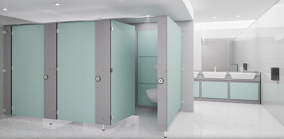
Brighter colours can also have a place in commercial design. Blue, green, yellow or muted pastel shades can introduce personality without making the space look excessive. Modern washroom collections now include a wide choice of colours and softer contemporary tones.
The best approach is to consider the size, lighting and purpose of the room before choosing a colour.
Neutral Colours Create a Timeless Look
Neutral colours remain a popular choice for commercial toilet cubicles because they are easy to coordinate with other elements. Light grey, warm grey, white and beige can create a professional appearance that does not quickly look dated.

A neutral palette can also make future refurbishment easier. If wall colours, flooring or lighting change, neutral cubicles can often continue to work with the new design.
For offices and professional environments, soft neutral colours can create a calm and polished atmosphere. They can also allow other design features, such as feature walls, artwork or branded elements, to stand out.
Bold Colours Can Add Brand Personality
A commercial washroom does not have to look generic. Colour can help businesses create a stronger visual identity.
For example, a sports facility may use energetic colours that reflect its brand. A hotel may choose sophisticated dark tones or warm wood effects. A creative office may use contrasting colours to create a more distinctive environment.
Colour can also be used in smaller areas rather than across the whole washroom. A neutral base with a contrasting door or pilaster can provide visual interest without overwhelming the space.
This approach is useful when businesses want a modern appearance while still maintaining a professional feel.
Woodgrain Finishes Bring Warmth to Commercial Washrooms
Woodgrain finishes can make a commercial washroom feel warmer and less clinical. They can work particularly well in hotels, restaurants, offices and premium customer-facing environments.
Modern laminate collections offer various wood-inspired finishes, from light oak effects to deeper walnut tones. These finishes can be combined with neutral walls, stone-effect surfaces and contemporary fittings.
The key is balance. Using a woodgrain finish on every surface may make the room feel too busy. A better option can be to use the wood effect for cubicle doors or selected panels while keeping the surrounding surfaces simple.
Texture Can Add Depth Without Adding Clutter
Colour is only one part of the design. Texture can also change how a washroom looks and feels.
Textured laminate finishes can create subtle visual depth. Stone effects, concrete-inspired finishes and brushed effects can give a contemporary appearance. They can also help break up large areas of plain colour.
Modern suppliers offer a growing selection of textures and material-inspired designs for commercial washrooms.
When selecting a textured finish, consider the rest of the room. A strong wall pattern combined with a highly textured cubicle finish may create too much visual activity. Simple combinations often produce a more sophisticated result.
Finish Choice Should Match the Environment
A good-looking finish is not enough. The material must also be suitable for the conditions in the washroom.
Some HPL cubicle systems are designed for predominantly dry commercial environments, while compact laminate systems can be suitable for wetter or more demanding areas. Product specifications should therefore be checked before making a final choice.
Busy environments also require durable surfaces. Schools, leisure centres, public buildings and high-traffic facilities may need materials designed to withstand frequent use, cleaning and general wear.
This is why colour and finish should always be considered alongside material performance.
Match Cubicles with Other Washroom Elements
The cubicles should not be selected in isolation. A well-designed washroom creates a connection between the cubicle panels, flooring, walls, vanity units, IPS panels, sanitaryware and fittings.
For example, light grey cubicles can work with darker flooring to create contrast. Woodgrain cubicles can be paired with warm neutral walls. A bold colour can be repeated through accessories or signage to create a consistent design.
Matching vanity units and other washroom elements can also help create a more complete appearance. Some commercial washroom suppliers provide coordinated products so that different parts of the room can follow the same design scheme.
Think About Cleaning and Long-Term Appearance
Commercial washrooms experience regular use. They also need frequent cleaning. Therefore, the finish should be chosen with maintenance in mind.
A colour that looks excellent in a showroom may not always be the easiest choice for a busy facility. Very pale surfaces can show marks, while very dark surfaces may make fingerprints and water marks more noticeable.
The right choice depends on the environment and cleaning routine. Easy-clean surfaces can help staff maintain a consistent appearance between deeper cleaning schedules.
Durability is equally important. High-traffic facilities need surfaces that can cope with repeated use. HPL and SGL systems are among the materials used in commercial washroom applications, but their suitability depends on the specific environment and product specification.
Use Colour to Improve Small Washrooms
Colour can be especially useful when designing a small commercial washroom.
Light and soft colours can reflect more light and help the room feel larger. Using similar tones across the cubicles, walls and floor can also create a more continuous appearance.
However, small does not mean boring. A carefully selected accent colour can add character without making the room feel crowded.
For example, light grey cubicles with a muted blue feature wall can create a clean and modern appearance. A small amount of contrast can make the design more interesting while maintaining a sense of space.
Consider Privacy and Visual Comfort
Colour and finish should support privacy as well as appearance. Full-height or increased-height cubicles can create a stronger sense of enclosure, while the finish can contribute to the overall visual experience.
A calm colour palette may make a private space feel more comfortable. In busy public environments, clear visual separation between cubicles can also help the washroom feel organised.
The final choice should therefore consider privacy requirements, room layout, lighting and the intended users rather than focusing only on appearance.
Choose Samples Before Making a Final Decision
Digital images are useful for comparing colours, but they should not be the only basis for a commercial specification. Screens can display colours differently from the physical material.
Many UK suppliers recommend requesting physical samples before confirming a project. This allows designers, contractors and building owners to see how the finish looks under the actual lighting conditions of the washroom.
A sample can also be compared with flooring, wall tiles, worktops and sanitaryware. This simple step can prevent an expensive design mistake.
Work with the Right Commercial Washroom Supplier
Choosing the right supplier can make the design process easier. A specialist should be able to discuss materials, colours, finishes, layouts and practical requirements.
For a complete project, businesses may also need commercial washroom supplies such as vanity units, IPS panels, sanitaryware, fittings and accessories. Coordinating these elements from the start can create a more consistent final result.
A specialist supplier such as Washroom Cubicles Direct Ltd can help businesses consider the practical and visual requirements of their washroom project while selecting suitable cubicle solutions.
Conclusion
Colour and finish can completely change the character of commercial washroom cubicles. The right combination can make a space feel brighter, warmer, more modern or more professional.
However, good design should never focus on appearance alone. Colour, texture, material performance, cleaning requirements, durability, lighting and the intended use of the washroom should all influence the final decision.
Whether you choose a timeless neutral, a bold corporate colour, a warm woodgrain or a contemporary textured finish, thoughtful specification can turn ordinary commercial bathroom cubicles into an important part of a well-designed commercial environment. With careful planning and suitable commercial washroom supplies, businesses can create washrooms that look attractive, perform reliably and remain practical for years to come.


Comments